Navigation
Install the app
How to install the app on iOS
Follow along with the video below to see how to install our site as a web app on your home screen.
Note: This feature may not be available in some browsers.
More options
You are using an out of date browser. It may not display this or other websites correctly.
You should upgrade or use an alternative browser.
You should upgrade or use an alternative browser.
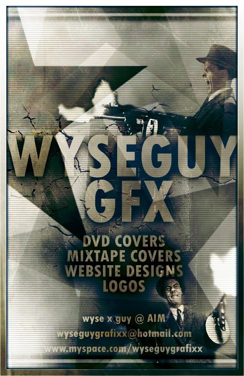
New Poster Design...
- Thread starter JR_Rider
- Start date

Lethal
ViragoAdmin Emeritus
- Joined
- May 27, 2000
- Messages
- 28,704
Visually, it's eye catching and nicely done, I think.
However, advertising yourself with AIM, a hotmail addy and a myspace page does not give me confidence in your professionalism.
However, advertising yourself with AIM, a hotmail addy and a myspace page does not give me confidence in your professionalism.
JR_Rider said:fixed the "wyseguy gfx' width to fit within the border, and made the Y darker

Much better!!!

However, advertising yourself with AIM, a hotmail addy and a myspace page does not give me confidence in your professionalism.
I agree totally, the thing is i just started in this graphic design thing, im working on a website right now, and one of these days i'll setup an email with my internet provider, so then i'll be official, thanks for the comments, much appreciated
Lethal
ViragoAdmin Emeritus
- Joined
- May 27, 2000
- Messages
- 28,704
Domain names and hosting are pretty cheap these days, even if you're just starting out, I'd say you'd be better off to go that route.JR_Rider said:I agree totally, the thing is i just started in this graphic design thing, im working on a website right now, and one of these days i'll setup an email with my internet provider, so then i'll be official, thanks for the comments, much appreciated
BTW, you mentioned DVD covers. I'd add CD covers to your arsenal. There are a lot of independent bands/labels out there that could use your services. Again, I'd say they are more likely to consider you if you use a domain addy and not hotmail.
LunchboX3904
[H]ard|Gawd
- Joined
- Apr 13, 2005
- Messages
- 1,524
i would lighten up that really dark star in the upper left portion. That's whats throwing the "Y" off. too contrasted. otherwise, looks nice!

Hyper_Psycho
2[H]4U
- Joined
- Mar 26, 2002
- Messages
- 2,944
secure a domain
remove aim name
put phone number and po box
pro: ensures professionalism
con: spam
remove aim name
put phone number and po box
pro: ensures professionalism
con: spam
Whilst agreeing with what has gone before, I am not sure that it fits purpose, it looks more like an advert for a film or computer game, than for a design company, the scaline effect re-enforcing that even further. Whilst demonstrating some of the techiques you are capable of doing, I am not sure it works. What you need to do (IMO) is do yourself a more subtle advertising blurb, and then link to example work, which can show off themed designs.
Hyper_Psycho
2[H]4U
- Joined
- Mar 26, 2002
- Messages
- 2,944
Karant said:LOVE the border. Any tutorials on how to do that?!
it seems its just a gradient