[REQ] Step by step through post

ilkhan

[H]F Junkie
Joined
Sep 23, 2002
Messages
13,797
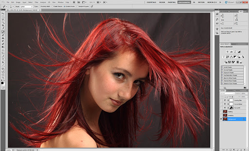
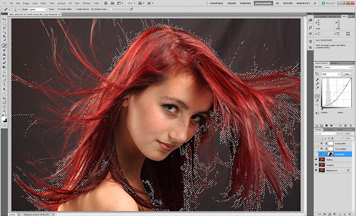
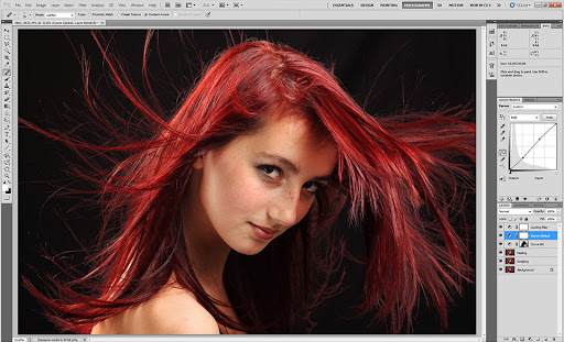
A request for those who actually know what they are doing in post (I certainly don't). Especially Jstamsek, SilverMK3, darktiger, etc.

Can you take some of your better images, post the start and end files, and go through the post process step by step. Not just what programs/tools, but also the settings for each tool and the why of each tool. I suck at post and would like to see the process you guys use from the raw image to the result.

Thanks.
 
You're better of just browsing tutorial websites.
http://www.digital-photography-school.com/post-production
http://lightroomkillertips.com/
Just to name the few. At least that's how I learned how to do most things. Also, reading books on the software at hand will give you a lot more knowledge about each setting. As well as experimenting with your own images after you've gone through that. Having darktiger/Silver/other post before/after shots with "...I bumped contrast to 65 to give it more pop..." isn't going to make you better at post processing.

I never go through the same process twice, at least not consciously. So I wouldn't even be able to tell you what I did with the photo. Every time I work with a photo, I set a goal for myself, but it's not going to be the same every time. If I know what I want the photo to look like, but I'm not sure how to get that look, I search the web for appropriate guides.

Anyway, I usually start with Lightroom, set the profile, fix the over/under exposure to the level I am satisfied with, fix white balance (if one needs to be fixed), and only then do I begin an actual work. And that work will vary depending on the project and time. Scripts in photoshop or presets in LR if I'm short on time. And if not, I use every tool Lightroom comes equipped with. I spent most of my time with curves and colors. Anything beyond that is just busy work to make the photo look clean.
 
Yeah that's a tough one to do as each image will have different things that require fixing or have a different tone that I want to emphasize. I've been doing a lot of HDR recently which means I can't use my normal workflow either.

What I find works well on other forums is to post one of your own photos for critique and ask people to go nuts on their own edits of it. You get some crazy results but as people explain their reasoning you learn a lot about post processing.

Maybe we should start a critique/edit thread and have any image posted in it open to edits / interpretations?
 
OP, the biggest thing you need to know when getting started in PP is learning to correctly read and adjust your brightness levels. The histogram graph in LightRoom shows the levels and how the image balances from dark to light. You will want most of your images to just barely touch each end of this spectrum, not too far weighted to either end. Drag the Exposure slider 'till the graph is mostly centered with nothing clipping on either end, then you can start tweaking from there to drag both ends back out 'till a little or a lot is clipping where you want it. You can add a Curves Layer in PhotoShop or use the older Levels function, or in LightRoom you can use the simpler named controls or the 4-slider levels section. It's all a matter of preference - just play around with the tools to see what you like for each image.

An important aspect of correctly processing the exposure of an image is to make sure there is still detail in all areas of the image - your shadow areas should still have detail, not just solid black or dark gray - adjust the Fill-Light in LR, or in PS use the Dodge tool to get detail back into your shadows. Your highlights should have detail, not just be blown-out areas of white: use the Recovery slider in LR and/or the Burn tool in PS to recover detail in your highlights.

The next thing you need to do is decide how to handle the color in your photos. It is easier to start out with Black & White images to practice getting the exact right exposures, but obviously the use of color can add powerful aspects to an image. I generally tend to either pull back the saturation in my photos to nearly B&W or crank up the saturation of selected colors to highlight certain features of a composition. My biggest advice here is just don't be afraid to tweak your colors if something doesn't work - if you have clashing colors or anything is distracting or doesn't work with the composition, change it.

Lastly, you'll want to learn to use the touch-up tools like Heal, Clone-Stamp, etc that will allow you to fix the blemishes in your photos like dust, pimples, unwanted clutter, etc. The better the photo was to begin with, the less of this will be required, but generally there's always a little bit that has to be done, depending on how attentive you are to the detail quality in your photos. These tools aren't too hard to use, but they require practice to work correctly - I'd recommend looking up tutorials on these to get the info you need.

But above all try to avoid going too far overboard when trying new effects - always try to keep a natural look to the photo - the worst thing you can do is have someone look at your image and immediately say "oh, I see what you did there" :p 
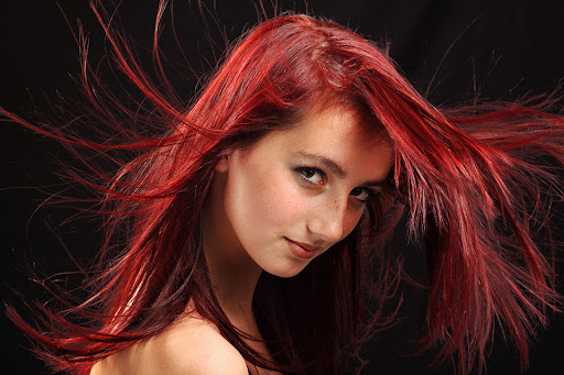
(a lot of this happens with people trying their first HDR images). It is extremely easy to go too far if you’re using a tool as powerful as PS and are having fun playing with all the tons and tons of options you have there. You want it to be subtle and mysterious when you use certain effects - combine a few effects very slightly so people will enjoy the image for what it is and not notice which effects were used.

All the rules of design can be broken to achieve desired results once you know what you’re doing, but for starters it’s best to learn the rules and stick to them to make sure you know how to create a quality image. Picking up a book on composition concepts and color theory, in addition to the usual books on photography concepts and exposure can go a very long way toward making your photos stand apart from the usual crowd.

The real goal of a photographer is to shoot images that are perfect right out of the camera, and I think you'll find several of the photographers here will say their images have minimal PP. As you get into photography and practice, you'll learn to control your subject and always control what elements go into each of your photos, learn to expose correctly for balanced value-levels, learn to focus on the correct areas in an image and use the correct aperture to maintain the correct depth of field, and lastly you'll need to learn the art of lighting your subject to control how they appear. In the end photography is all about catching light, so it can become much more about engineering the light in a scene or just knowing when/how to find the best light than it is about having the best camera gear or knowing how to post-process.
 
For me a lot of things effect me while I am PP. My mood, the mood of the picture, how tired I am,the music I am listening too, etc. I think madFive has some good advice. Also what software are you using for your PP? For me I use a combination of Lightroom and Photoshop CS5.

Every picture is different and I like to experiment. I started out a few years ago looking at other peoples pictures for their effect. Then I developed my own style.. I tend to go the bright and colorful route. Which you can see that in some of my photos.

If you post some examples of what you are trying to accomplish then I am sure a few of us on here can walk you through on how to get where you want. Or you can PM me some examples and I can create an action or preset for you to get you started.
 
I think the critique thread would probably be best. Kind've I wanted to see the result and the start and pick around with how they got there for a few images.
 
Not exactly a step-by-step, but here's a before & after of an image from 2009, shot in Cambodia about 3 months after I got my first DSLR.

Original straight-out-of-camera JPEG vs the recently re-processed RAW:

IMG_3090.JPG
IMG_3090_1200.jpg


What I did: (off the top of my head)
  • Sharpened from the camera default of 3 to max of 9 in Canon DPP
  • Cropped from 2:3 ratio to 4:5 to make the subject fill the frame more in DPP
  • Fixed the white balance (warmer, yellower tone) in DPP
  • Lifted the shadow detail end brought down the highlights in DPP
  • Cloned out the tree and distracting branch in Photoshop
  • Used the Selective Color tool on the green channel do bring down the brightness of the grass
  • Used the Selective Color tool on the reds and magentas to correct the skin tones
  • Used the Shadows and Highlights tool to tone down the grass some more
  • Applied some judicious dodging & burning to fix the crappy noon light
  • Used a mild HDR toning effect to pull more detail from the scarred face
  • Applied a large, light vignette to bring more attention to the center
  • Resized for web (bicubic sharper)

Hope this helps, even though it was really just about fixing the errors in the original exposure. :p
 
^Of all the photos you posted in the past, what possessed you to go with this one? :eek:

IMO, this screams Black&White.
 
^Of all the photos you posted in the past, what possessed you to go with this one? :eek:

IMO, this screams Black&White.

lol, yeah I figured you guys were sick of seeing pics of my kid and his cousins, also, it was a fair bit of work to recover from the original screw-up :p

I've tried a few different B&W conversions and haven't found one that 'pops' the way I'd like it to. You're welcome to try though! :D
 
Ok, so here's the SOOC shot.
6078056490_a098d57ed5_b.jpg

and processed
6074536517_96115f0d33_b.jpg

________________________________
1. Open the image in Photoshop and enter Quick Mask Mode by pressing Q on the keyboard, or select the Quick Mask icon.

2. Choose the Gradient Tool by pressing G on the keyboard, or select the Gradient Tool icon. Be sure to choose the Reflected Gradient option

3. Draw a vertical line; the start point will be the centre of the in-focus area, and the end will be where the transition from in-focus to out-of-focus is completed. This step, and the subsequent two steps, will need a fair degree of trial and error.

4. Before progressing, review the position of the red mask. The middle of the mask is where the in-focus area will be, gradually losing focus towards the edges. Note the out-of-focus effect is yet to be applied.
6078070294_155f665196_b.jpg


5. Press Q on the keyboard to exit Quick Mask Mode and return to Standard Mode, or press the icon on the Tool Palette. The area to apply the focus effect to will be surrounded by the "marching ants" selection lines

6. Choose Filter > Blur > Lens Blur

7. Messed around with Saturation a bit and sharpened the image.

8. Open a bottle a wine and enjoy.

Also, you can see that I used the smudge tool to fix the roof on the top left corner to finish the roof off. I didn't like the white part.
 
Since I'm in the process of editing a large batch of images, I thought I'd dissect one for you guys.

Here's my disclaimer - I'm completely self-taught so there may very well be a better way of doing things, if there is, AWESOME, Let me know!

Step 1: The original image
This is the JPG straight from Canon DPP where I did some exposure and WB tweaks.

Edit_Step1_Original.jpg

.
.


Step 2: Dodging
After making a duplicate layer (Ctrl+J), I start using the dodging tool on the irises and any shadowed areas of the face.

Edit_Step2_Dodging.jpg

.
.

Step 3: Healing
After making another duplicate layer, I used the healing brush set to Lighten on the larger freckles that didn't add character (I liked the ones on the nose).

Edit_Step3_Healing.jpg

.
.

Step 4: Part 1: Mask Selection
I make a new Curves adjustment layer, click on the mask icon (white box) then go to Select > Color Range and start shift-clicking different areas of the gray background to build a good background selection. I then used the lasso tool to deselect areas of the face and hair that I didn't want included. After that I used the 'Refine Mask' tool, bump the contrast and get a good mask built. Afterwards I'll go back and tweak it with a large, soft brush tool set to black or white to paint in/out different areas of the selection.

Edit_Step4_1_Mask_Selection.jpg

.
.

Step 4: Part 2: Background Curve
With the mask made in part 1, any curves adjustment I make will only apply to the background and certain areas of the hair. I used this to darken the gray background considerably because my umbrella spilled far too much light onto the backdrop.

Edit_Step4_2_Background_Curve.jpg

.
.

Step 5: Global Curve
I then made another curves layer to adjust the contrast/brightness of the final image to make the features pop just a little more. I also applied a light (4%) cooling filter for some extra color correction but I didn't bother taking a separate screenshot because it's only barely visible.

Edit_Step5_Global_Curve.jpg

.
.

The final image
And here's the final, edited image! :D
Final_Image.jpg


Hope this helps!
- Dave
 
One tip if you are trying to separate hair and background (hard thing to do) is to go to the channels section duplicate whichever channel gives you the most contrast between background and face/hair, turn this into a mask by fiddling with curves etc until you end up with black background white face/hair.

Here's a tutorial
 
Last edited:
Nice Dave... you're forgetting the wine though! lol

Haha, I've learned my lesson with alcoholic beverages at the computer desk... It never ends well and I tend to have to replace keyboards, card readers, etc. the next day!


One tip if you are trying to separate hair and background (hard thing to do) is to go to the channels section duplicate whichever channel gives you the most contrast between background and face/hair, turn this into a mask by fiddling with curves etc until you end up with black background white face/hair.

Nice, thanks! I'll give it a shot, I've got about 40 images with 3 other models to edit and they all have tons of hair
 
29023110150265179536868.jpg


dolmen.jpg


Sharpened, upped contrast with curves and contrast layer, added a bit more red and green. Generally Trying to avoid post processing with my images, working towards getting images as close to perfect with the camera.

dolmen2y.jpg


Finally add more contrast to shadows and adjust color again
 
Last edited:
I'd like to see more in this thread, not so much step by step process but images before and after photoshop/lightroom.

Everyone always posts pictures they've spent a long time playing with to look nice.... would like to see what sort of pictures those uber expensive/nice cameras people have can take before PP
 
Nice, I love B&W HDR's - it approaches the dynamic range available in actual black and white film.

Going with the HDR theme, this is less of a 'check out what I did' and more of a 'did I go too far?'. I used a mild HDR layer over top of the original image at 60% fill in an attempt to fix my failed, flat lighting setup.

IMG_5213_hdr.jpg


Too far?
 
Something a lil different, made this a few years ago:

Start with the image-

2r7na0p.jpg


start making parts, that you then texture and edit, and throw them all around in an unorganized mess-

10qdoqv.jpg


duplicate layers, start building the structure and giving it form-


bdwmjk.jpg


start working it into the image..

r7p4s4.jpg


and about 200+ layers later and many more hours you have the finished one :-D

3428384533_821d0ab6fc_b.jpg
 
Working on some new processing techniques. This one has an HDR layer blended in at ~80% luminosity:
sb_5.jpg
sb_5.jpg
 
Back
Top